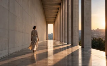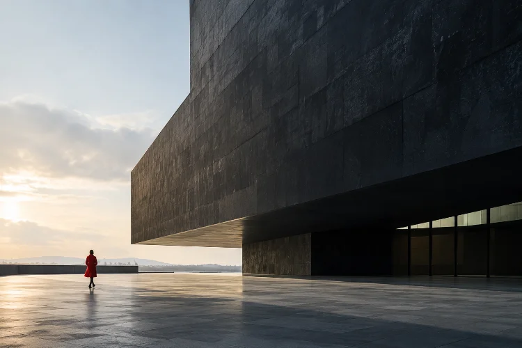
Two objects can occupy completely different amounts of space in a photograph yet somehow feel equally important.
A tiny bright figure may compete with an enormous dark building, while a small red object can attract more attention than a much larger neutral background. That effect comes from visual weight.
Visual weight describes how strongly an element attracts the viewer’s attention within a composition. Size matters, but it is only part of the equation.
Brightness, contrast, color, texture, sharpness, position, negative space, and even the familiarity of a subject can change how “heavy” something feels inside the frame.
Understanding how visual weight changes balance across advanced photo layouts gives photographers far more control than simply placing subjects according to a grid.
Instead of asking whether both sides of an image contain the same amount of material, you begin asking whether they carry comparable perceptual importance.
Once you understand that distinction, balance becomes much more flexible – and much more interesting.
Visual Weight Is Different From Physical Size
It is easy to assume that the largest object automatically dominates a photograph.
Sometimes it does, but not always.
Visual weight depends on how strongly something separates itself from the rest of the frame. Adobe notes that photographic balance can be created by distributing visual weight through factors such as light, color, and negative space, even when a composition is not symmetrical.
Imagine a huge gray wall with one person wearing a bright yellow jacket near its edge. The wall occupies most of the image, yet the person may still become the first thing you notice.
Why?
The human figure is distinctive, the color contrasts with the surroundings, and the surrounding empty space gives that small subject additional emphasis.
This is why advanced composition should be judged by perceived importance rather than simple measurements.
Size and Scale Change the Balance of a Frame
Larger elements generally carry more visual presence, particularly when they sit close to the camera.
A large foreground object can therefore make one side of a photograph feel considerably heavier than the other. To balance it, photographers may need another element elsewhere in the frame – a brighter highlight, several smaller subjects, or a strong area of color.
Suppose a portrait places a person close to the left side of the camera. Their face occupies a large percentage of the frame.
The right side does not necessarily need another equally large person.
A distant window with strong sunlight could provide enough opposing visual weight. So might several smaller figures grouped together.
This is the basic idea behind asymmetrical balance. StudioBinder defines it as using different visual elements with unequal physical characteristics while still creating an overall feeling of equilibrium.
The result often feels more dynamic than simply mirroring both sides.
Contrast Can Make Small Elements Feel Heavy
Contrast is one of the fastest ways to change visual weight.
A tiny white object against a nearly black background attracts attention because the tonal difference is extreme. The same object placed against a pale wall may barely register.
Nikon recommends separating subjects from their backgrounds using differences in tone, color, lighting, or focus to direct attention more effectively.
This becomes especially useful in complex photo layouts.
Imagine photographing a nighttime street filled with buildings and pedestrians. Most of the frame is dark, but one illuminated shop window occupies only a small area.
That window can visually counterbalance a much larger shadowy building on the other side.
Contrast therefore behaves almost like a multiplier. An element does not need to be large if it is dramatically different from everything around it.
Photographers who understand this can create balance without filling every part of the compositon.
Color Changes Where the Eye Travels
Color carries its own kind of visual energy.
Bright or highly saturated colors often stand out strongly when surrounded by muted tones. Nikon’s guidance on photographic design notes that color relationships can play an important role in creating visually dynamic images.
Consider an image dominated by blue-gray architecture.
A person carrying a red umbrella might occupy less than five percent of the frame, yet the umbrella could become the strongest focal point.
That creates an interesting compositional challenge.
If the red object appears near one edge, the opposite side may need another source of weight – perhaps a larger building, deeper shadow, repeated figures, or stronger texture – to prevent the image from feeling as though it is visually tipping toward the umbrella.
This does not mean every colorful element must be countered with another colorful object.
Visual balance is about relationships, not duplication.
A vivid small subject can easily be balanced by a large area containing quieter but more substantial forms.
Position Can Make the Same Subject Feel Different
Where an element appears matters almost as much as what it looks like.
A centered subject usually creates a relatively stable arrangement because visual attention sits close to the structural center of the frame. Symmetrical compositions often emphasize this effect and can create a strong sense of order.
Move the same subject toward one edge, however, and the balance changes immediately.
Now the opposite side becomes more important.
Nikon’s rule-of-thirds guidance illustrates how moving subjects away from the center can create pleasing compositions and recommends leaving directional space where a person, animal, or moving subject is looking or traveling.
That open area has visual value even though it contains relatively little information.
In advanced layouts, photographers can deliberately push subjects toward corners or edges to generate tension.
A portrait positioned unusually close to the frame boundary may feel uncomfortable or energetic. Give the same subject generous space and the mood can become calmer.
Placement does not simply balance objects. It affects emotion.
Negative Space Has Visual Weight Too
Empty space might appear weightless, but composition does not work that simply.
Large areas of negative space can become powerful precisely because they contrast with detailed parts of the frame.
Adobe describes negative space as an important design principle that gives elements room to breathe, helps establish order, and can make balance easier to achieve.
Imagine a small boat crossing a huge empty sea.
Technically, most of the photograph contains almost nothing. Yet the open water provides scale and gives the boat stronger significance.
This is where negative space behaves differently from ordinary objects.
It does not attract attention through detail. Instead, it changes how attention is distributed around whatever remains.
A crowded subject surrounded by emptiness may feel surprisingly heavy because there is nothing nearby competing with it.
That relationship is especially valuable in editorial, minimalist, architecture, landscape, and fine-art photography.
Empty space is not an unfinished part of the layout. It is part of the visaul structure.
Texture and Detail Can Shift Visual Balance
A heavily textured area usually attracts more inspection than a smooth one.
Imagine one side of a photograph containing weathered brick, signs, cables, windows, and people, while the other contains a plain concrete wall.
Even if both sides occupy exactly half of the frame, they will probably not feel equally weighted.
The detailed side contains more visual information.
This is closely related to figure-ground perception. The Interaction Design Foundation explains that viewers naturally separate prominent figures from surrounding ground, with contrast, texture, and other differences helping establish hierarchy.
Photographers can use this deliberately.
A simple subject might need a relatively quiet background to remain dominant. Conversely, a subject with strong color or contrast can survive inside a far more complicated enviroment.
Sharpness also affects perceived weight.
A sharply focused eye in a portrait can attract more attention than much larger areas of blurred clothing or background. Selective focus therefore does more than isolate a subject—it changes the balance of the entire frame.
Multiple Small Elements Can Balance One Large Subject
Visual weight becomes especially interesting when several objects work together.
Five small people standing close together may behave like one larger compositional mass. Repeated windows, lights, chairs, trees, or signs can have a similar effect.
This allows photographers to balance one dominant element against a collection of minor ones.
Imagine a street photograph where a large bus fills the left side of the frame. On the right, several pedestrians occupy much less total space.
Individually, none of the people balances the bus.
Collectively, however, their repetition, shapes, movement, and human interest may provide enough opposing weight.
This is one reason advanced photo layouts rarely need perfect symmetry.
A balanced composition, according to Nikon’s photography glossary, involves a harmonious distribution of objects, tones, or patterns rather than simple duplication.
Learning to see groups as visual masses makes complicated scenes much easier to organize.
Asymmetrical Balance Often Creates More Energy
Perfect symmetry can be powerful, but it also tends to feel predictable.
Asymmetrical balance introduces variation.
Instead of putting equal objects on each side, photographers can balance a large dark form against a small bright form, a detailed subject against negative space, or one figure against several distant figures.
StudioBinder notes that asymmetrical arrangements can create movement, variety, and visual intrigue while still maintaining an overall sense of balance.
This makes asymmetry particularly useful in documentary photography, fashion, editorial portraits, street photography, and cinematic imagery.
The frame can feel controlled without feeling static.
The key is avoiding accidental imbalance.
If one corner contains strong color, extreme contrast, detailed texture, and a large object while every other area remains visually weak, the photograph may feel heavily tilted.
Instead, distribute attention intentionally.
You do not need equal objects. You need meaningful counterweights.
Train Yourself to See Weight Before Pressing the Shutter
Visual balance becomes easier once you stop identifying objects by name.
Instead of thinking “person, building, tree,” temporarily see them as shapes, tones, colors, and masses.
Ask which area your eye notices first.
Then notice where it travels next.
If attention becomes trapped in one corner, experiment with moving yourself, changing focal length, adjusting the crop, simplifying the background, or waiting for another element to enter the frame.
Nikon encourages photographers to explore scenes from different angles and distances instead of accepting the first composition they encounter.
You can also try squinting slightly while viewing a scene or image. Fine detail becomes less obvious, making dominant shapes and tonal masses easier to recognize.
With practice, visual weight stops feeling abstract.
You begin sensing when a photograph feels balanced before consciously explaining why.
Visual weight changes photographic balance because viewers do not judge every element equally. Scale, contrast, color, position, texture, sharpness, negative space, and repetition can all make one part of an image feel heavier or lighter than its physical size suggests.
Understanding these relationships gives photographers much greater compositional freedom. You no longer need symmetrical objects or perfectly equal halves to create a stable image.
Start experimenting with uneven arrangements. Place a small bright subject against a large quiet area, balance one dominant form with several smaller objects, and study how moving elements changes the frame.
The goal is not mathematical perfection. It is creating a layout where attention moves intentionally – and where every element contributes to the story.