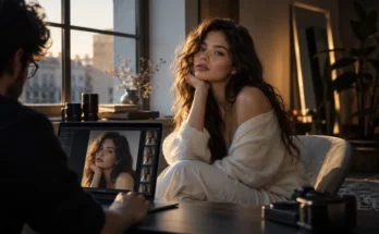
Some photographs look technically correct but still feel flat. The exposure is fine, the colors are accurate, and nothing is obviously wrong – yet the image does not have the depth, atmosphere, or emotional pull of a professionally finished edit.
Color curves are often what make the difference. Curves allow photographers to reshape specific tonal regions instead of simply making the whole image brighter, darker, or more contrasty.
A tiny adjustment can deepen shadows, soften highlights, lift blacks, brighten midtones, or introduce subtle color into selected parts of the tonal range.
Understanding how color curves shape contrast and mood in professional editing gives you much more control than relying on basic contrast sliders alone.
You can create crisp commercial images, soft editorial portraits, faded film-inspired grades, or dramatic cinematic looks without rebuilding the entire edit.
The curve itself may look intimidating at first, but the principle is simple: you are deciding how the original brightness and color values should be translated into the final photograph.
Understand What the Curve Is Actually Doing
A standard curve begins as a straight diagonal line.
The horizontal axis represents the original tonal values, while the vertical axis represents the values after your adjustment. Dark tones sit toward the lower-left corner, midtones occupy the center, and highlights appear toward the upper-right.
Adobe explains that moving curve points upward brightens the selected tonal range, while moving them downward darkens it. Steeper sections create more contrast, while flatter sections reduce contrast.
That relationship is the foundation of almost every curve technique.
If you add a point around the shadows and lower it slightly, those darker tones become deeper. Raise a point in the highlights and brighter areas become more luminous.
The important thing is that nearby tonal values are influenced gradually.
Unlike crude brightness adjustments, curves can create smooth transitions between the areas you change and those you leave alone.
That makes them ideal for polished professional editing.
Use the S-Curve to Build Controlled Contrast
The classic S-curve is popular because it creates contrast without requiring dozens of adjustments.
Lower the darker part of the curve slightly and raise the brighter section. The resulting line resembles a gentle S.
Adobe specifically notes that increasing the slope through the middle of the curve increases midtone contrast.
This gives portraits more dimension, landscapes greater separation, and product photography stronger definition.
But stronger is not always better.
An aggressive S-curve can crush shadow detail, brighten highlights too much, and make skin appear harsh. It may also intensify saturation depending on the software and curve mode you are using.
Start with a very shallow shape.
Professional contrast often comes from small adjustments distributed across the tonal range rather than one dramatic move.
If your edit immediately screams “high contrast,” the curve may already be doing too much.
Shape Mood Through the Black and White Points
Contrast is not only about the middle of the curve.
The endpoints can completely change the character of an image.
The lower-left endpoint normally maps the darkest information to pure black. Raise that endpoint and your deepest shadows become dark gray instead.
This creates lifted blacks.
The technique is common in faded, film-inspired, lifestyle, and editorial photography because it removes some of the harshness from the darkest areas.
Move the endpoint too far, however, and the photograph can begin looking washed out.
The opposite idea applies to the white point. Pulling the upper-right endpoint downward prevents the brightest areas from reaching pure white, producing softer highlights.
Adobe’s Curve interface maps the darkest values at the lower-left and brightest values at the upper-right, making these endpoints fundamental controls for tonal mapping.
A small endpoint adjustment can change mood significantly without altering the entire composition.
That is why black and white points are often more powerful than they first appear.
Control Midtones Without Destroying Highlights
Midtones contain much of the visual information people care about.
Faces, clothing, buildings, foliage, interiors, and textured surfaces frequently sit somewhere in the middle of the tonal range.
Curves let you brighten or darken these areas while anchoring the shadows and highlights.
Add a point near the lower section and another near the upper section to hold those regions in place. Then adjust a central point to change the middle tones more selectively.
Lightroom’s Curve tool allows highlights, midtones, and shadows to be targeted independently, and Adobe recommends watching the histogram while making those adjustments.
This technique is useful when an image feels dull but the brightest areas are already where you want them.
Instead of increasing overall exposure, lift only the middle section.
For portraits, this can brighten faces while preserving bright windows or specular highlights.
For landscapes, it can reveal more terrain detail without flattening the sky.
That tonal seperation is one of the biggest advantages curves offer over broader sliders.
Use RGB Channels to Add Color to Specific Tonal Regions
Curves become even more interesting when you stop adjusting brightness and start adjusting individual color channels.
In an RGB editor, you can usually work separately with red, green, and blue curves.
Lightroom, Photoshop, and Capture One all support individual RGB channel adjustments.
Raise the blue curve in the shadows and dark areas become bluer. Lower it and those shadows shift toward blue’s complementary color, yellow.
The same principle applies to the other channels.
Raising red adds red; reducing red introduces cyan. Raising green introduces green, while lowering it moves tones toward magenta.
This allows very precise creative grading.
You might add a small amount of blue to shadows while warming brighter areas through the blue curve’s highlights. The result can create cinematic cool-warm contrast without placing the same tint across the entire image.
Capture One also notes that its individual Red, Green, and Blue curves can be used to correct color casts or introduce color into shadows, midtones, and highlights.
Keep these moves subtile.
Channel curves become obvious very quickly when pushed too far.
Know the Difference Between RGB and Luma Curves
Not every curve changes the image in exactly the same way.
A combined RGB curve can affect both brightness and perceived saturation. Increasing contrast may make colors appear stronger as tonal values move farther apart.
Some editors therefore provide a luminance-based curve.
Capture One’s Luma Curve is designed to change brightness and contrast without increasing saturation in the same way as its combined RGB curve.
DxO PhotoLab similarly provides RGB and luminance-oriented channel control, noting that luminance adjustments can help preserve color relationships, including skin tones.
This distinction matters when editing portraits.
Suppose the contrast looks too soft, but skin saturation is already perfect. A strong RGB curve could unintentionally make red and orange tones more intense.
A luminance-focused curve can often increase tonal contrast while keeping the color palette more stable.
There is no universally better option.
Choose based on whether you want contrast and color intensity to move together or remain more independent.
Use Curves to Create Highlight Roll-Off
Professional editing is often less about making highlights brighter and more about deciding how they transition toward white.
Harsh highlights can feel digital, especially in portraits, wedding photography, and cinematic editorial work.
Curves allow you to soften that transition.
Place a control point in the upper tonal range and gently flatten the curve as it approaches the white point. This reduces contrast among the brightest values.
The result is a smoother highlight roll-off.
Bright skin, clouds, window light, and reflective surfaces can retain a softer appearance rather than jumping abruptly toward pure white.
Capture One describes curves as useful for remapping tones within the shadow and highlight limits established by broader tonal controls such as Levels.
Do not flatten too much.
If the upper section becomes almost horizontal, different bright values begin collapsing toward similar outputs, and the photograph can lose sparkle.
Good roll-off maintains detail while making the transition feel more graceful.
Keep Curve Adjustments Non-Destructive
Curves encourage experimentation, which is another reason they should remain editable.
In Photoshop, using a Curves adjustment layer keeps the tonal changes separate from the original image pixels. Adobe recommends adjustment layers for non-destructive tonal and color editing because they can be revised without permanently altering the underlying file.
This becomes especially useful when several curves are involved.
You might use one curve for contrast, another for color grading, and a third with a mask for local adjustment.
Separating them makes troubleshooting easier.
If skin suddenly becomes too red, you can identify which curve caused the problem rather than trying to reverse an entire stack of edits.
It also allows opacity control.
Sometimes a curve looks excellent at 100 percent while editing but feels too intense when you return later. Lowering the adjustment’s strength may produce a more consistant result.
Professional workflows benefit from being reversible.
Avoid Adding Too Many Control Points
Curves offer precision, but precision can become a trap.
Adding ten or fifteen points may feel advanced, yet complicated curves are often harder to control and can produce uneven tonal transitions.
Use the fewest points necessary.
If you want a simple S-curve, two or three control points may be enough. If you need to protect the highlights while adjusting midtones, add only the anchors required to hold those regions.
Adobe supports multiple control points in Curves, but each point influences the shape around it.
Too many nearby points can create small bends that produce unnatural shifts.
The same applies to RGB channel curves.
A complicated series of tiny color corrections can introduce strange casts into different tonal regions, especially when several channels overlap.
Zoom out frequently and look at the complete photograph.
The curve graph matters, but the image matters more.
Judge Curves by Mood, Not by Their Shape
There is no perfect-looking curve.
Two completely different curve shapes can produce excellent results on different photographs.
A dark editorial portrait might need deep shadows, restrained highlights, and a cool channel adjustment. A bright lifestyle image could benefit from lifted blacks, softer contrast, and warm upper midtones.
The curve should respond to the image and the story.
This is particularly important when using presets.
A saved curve can provide a useful starting point, but the same curve will behave differently on photographs captured under different exposure, lighting, and color conditions.
The goal is not to reproduce the same graph every time.
It is to reproduce a recognizable visual feeling.
Once you start judging curves according to atmosphere rather than slider positions, editing becomes much more intuitive.
Color curves are among the most flexible tools in professional photo editing because they control both technical contrast and creative mood.
They can deepen shadows, lift blacks, brighten midtones, soften highlight roll-off, and introduce carefully targeted color through individual RGB channels.
The key is restraint.
Start with simple curves, use only the control points you need, and pay attention to how every change affects the entire tonal range. Experiment with RGB and luminance curves rather than assuming they behave identically.
For your next edit, try building the mood mainly through curves before reaching for multiple effects. Shape the contrast first, refine the endpoints, then experiment with small channel adjustments.
Once you understand how the curve translates tone and color, you gain much more intentional control over the final image.