A beautiful image can grab attention, but a well-composed image can make someone stop, look again, and wonder what is happening beyond the frame. That difference is where visual storytelling really begins.
Composition is often introduced through simple ideas such as the rule of thirds, centered subjects, or leading lines.
Those techniques are useful, but advanced composition goes much further. It considers how every element inside the frame works together to control attention, suggest relationships, create emotion, and reveal information.
In photography, filmmaking, illustration, advertising, and digital design, strong composition is rarely accidental. Creators decide where a subject appears, how much empty space surrounds it, what stays in focus, and which visual elements compete for attention.
Understanding how advanced composition creates stronger visual storytelling allows you to move beyond simply making an image attractive.
Instead, you begin designing frames that communicate ideas before a viewer reads a caption, hears dialogue, or receives any additional explanation.
Composition Is Really About Controlling Attention
At its core, composition decides where the viewer looks first, second, and third.
Every frame contains a visual hierarchy. A bright face against a dark room may immediately become the focal point. A road stretching toward a distant figure can guide the eye through the scene. A large foreground object may establish context before the viewer notices the main subject.
This is why advanced composition is less about following formulas and more about managing attention intentionally.
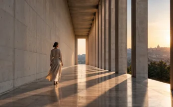
Adobe describes leading lines as visual elements that guide the viewer’s eye toward a subject or important area of an image. Roads, architecture, shadows, fences, rivers, and even repeated objects can perform this function.
The important question is not simply, “Does this photograph have leading lines?” Instead, ask, “Where are those lines taking the viewer, and why?”
That shift in thinking turns composition from decoration into storytelling.
Visual Hierarchy Helps the Audience Understand the Scene
Good visual storytelling usually gives the audience somewhere obvious to begin.
Imagine a photograph showing a chef working inside a crowded restaurant kitchen. If every plate, employee, light, utensil, and background object carries equal visual weight, the image may feel chaotic.
Now imagine the chef is positioned in stronger light while secondary workers remain slightly darker and farther away. Suddenly, the hierarchy becomes clear. The viewer understands who matters most while still seeing the surrounding enviroment.
Contrast, scale, focus, positioning, color, and negative space can all influence this hierarchy.
Gestalt perception principles are useful here as well. The figure-ground principle describes how viewers distinguish an important foreground figure from its surrounding background, allowing designers and visual creators to establish clearer hierarchy.
Effective visual hierarchy does not remove complexity. It organizes complexity so that the audience knows how to read it.
Depth Turns Flat Frames Into Story Spaces
A camera produces a two-dimensional image, but composition can make that image feel surprisingly deep.
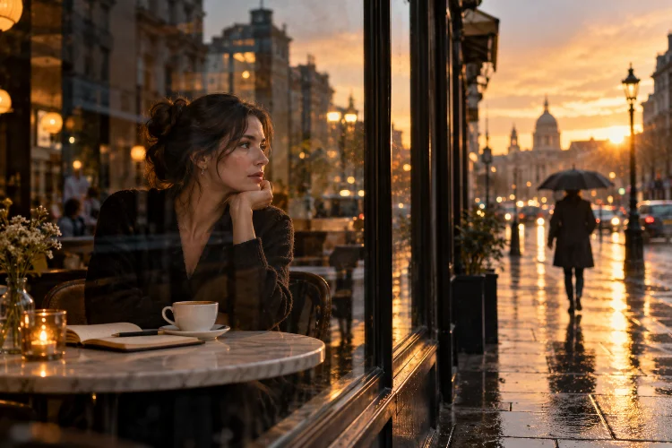
One of the easiest ways to achieve this is by thinking in layers: foreground, middle ground, and background.
Suppose you are photographing someone waiting at a train station. Instead of placing the person against an empty wall, you might include a blurred suitcase in the foreground, the person in the middle ground, and an arriving train in the background.
Those layers immediately communicate more information.
StudioBinder explains that foreground, middle-ground, and background placement can create greater dimensionality within film frames. Depth of field can then influence which layer receives the strongest attention.
Depth can also reveal relationships. Two characters separated across different planes may appear emotionally distant. Bringing them into the same visual plane can make them feel more connected.
This means depth is not merely a technical effect. It can become part of the narrative itself.
Negative Space Can Say More Than Additional Objects
Beginners sometimes feel that every part of a frame needs to contain something interesting.
Advanced composition often does the opposite.
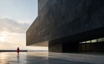
Negative space gives important elements room to breathe. More importantly, empty areas can communicate loneliness, uncertainty, freedom, scale, tension, or expectation.
Picture a lone traveler standing at the far edge of a huge desert landscape. Filling the frame with the traveler would provide more physical detail, but making the person relatively small may communicate the enormous scale of the journey more effectively.
Negative space also helps prevent visual clutter.
The trick is to see empty space as an active compositional element rather than unused territory. A large blank area above a character can suggest vulnerability. Space in front of a moving subject may imply direction, while insufficient space can create discomfort or confinement.
These are subtile decisions, but they strongly affect how a scene feels.
Balance Does Not Always Mean Symmetry
Symmetrical composition can feel controlled, stable, formal, or even intimidating.
But visual balance does not require identical objects on both sides of the frame.
Advanced composition often relies on asymmetrical balance. A large subject near one side might be balanced by several smaller elements on the opposite side. A dark object may visually balance a brighter but smaller feature elsewhere.
Nikon’s composition guidance emphasizes that photographers constantly make decisions about framing and subject placement rather than relying on one rigid method for every scene.
Symmetry might work beautifully when photographing monumental architecture, ceremonial environments, or highly controlled interiors.
Asymmetry can feel more spontaneous and energetic. It is particularly useful when you want the eye to travel through the image instead of immediately settling at the center.
Understanding the emotional effect of balance allows creators to choose composition based on meaning rather than habit.
Repetition and Visual Rhythm Create Movement
Images cannot physically move, yet composition can make the eye feel as though it is traveling.
Repeated shapes, colors, people, shadows, windows, columns, or lights can create visual rhythm.
Imagine a row of identical chairs with one chair turned in another direction. Repetition establishes a pattern, while the disruption immediately attracts attention.
That single compositional choise can tell a miniature story: something is different here.
Gestalt principles also explain why repeated visual characteristics matter. Similar colors, shapes, sizes, and orientations tend to be perceived as belonging together, helping viewers recognize patterns and relationships.
Visual rhythm is particularly powerful in architecture, street photography, editorial photography, graphic design, and cinematic framing.
Once a pattern exists, breaking it becomes a storytelling tool.
Relationships Inside the Frame Matter More Than Perfect Rules
Composition rules are valuable starting points, but advanced storytelling begins when creators understand why those rules work.
The rule of thirds, for example, can produce comfortable subject placement. But a centered portrait may create stronger intensity. Extreme edge placement may produce anxiety. Deliberately cutting off part of an object can introduce mystery.
StudioBinder notes that shot composition is fundamentally about arranging visual elements to convey an intended message, reveal character, and influence emotion.
This means there is no universally correct frame.
Consider two people having an argument. Placing them close together might increase confrontation. Separating them with a doorway, wall, or piece of furniture can visually reinforce emotional distance.
The strongest composition is therefore not necessarily the prettiest one. It is the composition that best supports what the audience should understand or feel.
Learn to Remove Before You Add
One of the most practical ways to improve composition is surprisingly simple: remove distractions.
Before taking a photograph or finalizing a frame, look around its edges. Is there a bright object competing with the subject? Does a background line appear to grow awkwardly from someone’s head? Does unnecessary clutter weaken the story?
Changing position by only a few steps can dramatically alter a composition.
Nikon recommends exploring subjects from different angles and distances rather than photographing them immediately from the first viewpoint that appears.
Try moving closer, lowering the camera, changing the focal length, waiting for background elements to move, or simplifying the scene entirely.
Advanced composition is often less about finding more interesting objects and more about deciding what the image does not need.
The cleaner that decision becomes, the stronger the visual message usually feels.
Advanced composition transforms images from attractive arrangements into deliberate storytelling systems.
By controlling visual hierarchy, depth, negative space, balance, repetition, focus, and relationships between subjects, creators can guide attention and communicate emotion without explaining everything directly.
The goal is not to memorize dozens of composition rules. It is to understand how different visual decisions influence the viewer’s experience.
Start studying photographs, films, advertisements, and illustrations you already admire. Ask yourself where your eye goes first, what creates that direction, and how the frame would feel if those elements changed.
Then experiment. Break symmetry, simplify backgrounds, explore unusual angles, or introduce more visual rythm. The more intentionally you compose, the more effectively every frame can tell its own story.