Editorial photography has an unusual job. A photograph needs to attract attention, communicate an idea, fit into a publication layout, and often leave enough visual room for headlines or other design elements.
Trying to fill every corner of the frame can actually make those goals harder to achieve.
That is where negative space becomes powerful. Negative space is the relatively empty or visually quiet area surrounding the main subject.
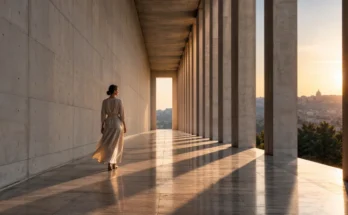
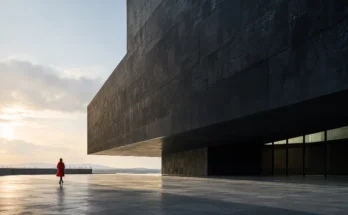
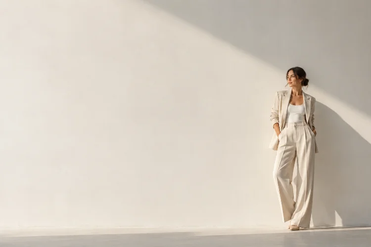
It might be an open wall behind a portrait, a huge area of sky above a landscape, an empty section of pavement beside a person, or even a soft shadow occupying much of the frame.
Understanding why negative space improves impact in editorial photography can completely change the way photographers approach composition. Instead of viewing empty areas as wasted space, they become active storytelling tools.
Used intentionally, negative space can strengthen visual hierarchy, highlight emotion, establish scale, simplify complex scenes, and give editors greater flexibility when designing pages. Sometimes, showing less really does communicate more.
Negative Space Immediately Strengthens the Main Subject
A photograph becomes difficult to read when too many objects compete for attention.
Negative space solves part of this problem by reducing visual competition around the main subject. Adobe describes negative space photography as an approach that emphasizes both the subject and the emptiness surrounding it, helping place stronger attention on the focal point.
Imagine an editorial portrait of an entrepreneur standing in an office.
One version shows computers, chairs, shelves, employees, posters, windows, and paperwork surrounding the person. The photograph provides context, but the subject may become just another element within the clutter.
Another version places the same person against a large, clean concrete wall.
Now the eye has almost nowhere else to go.
This is one reason negative space can create such powerful editorial portraits. The visual message becomes quicker to understand, even when the person occupies only a small portion of the frame.
The compositon feels simple, but the simplicity is intentional.
Empty Areas Create Stronger Visual Hierarchy
Editorial images often compete with headlines, captions, page furniture, advertising, and other photographs.
A strong visual hierarchy is therefore extremely important.
Negative space helps establish that hierarchy by creating clear differences between important and secondary areas. The Interaction Design Foundation notes that whitespace can help create visual hierarchy and guide attention toward elements that deserve greater emphasis.
The same principle works inside a photograph.
If a fashion model occupies one side of a large minimalist studio, the eye naturally identifies the person as the main point of interest. The surrounding floor or wall becomes visually quieter.
This does not mean the empty area contributes nothing.
Quite the opposite.
Its lack of detail makes the detailed subject feel more important. The relationship between positive space – the subject – and negative space determines how visual weight is distributed.
Good editorial composition therefore depends not only on deciding what should appear in the frame, but also on determining what should remain visually quiet.
Negative Space Gives Editorial Layouts More Flexibility
Editorial photography is rarely viewed in isolation.
Images may appear in magazines, newspaper features, websites, newsletters, social media promotions, or digital cover stories. Designers sometimes need room for headlines, introductions, pull quotes, or navigation elements.
Photographs with thoughtfully positioned negative space can provide that flexibility naturally.
For example, an environmental portrait could position a musician on the right side of the frame while leaving a softly lit wall on the left. That empty region can support a magazine headline without covering the person’s face or damaging the original composition.
This does not mean photographers should always shoot empty areas simply for text placement. The photograph still needs to work visually on its own.
However, understanding likely editorial use can influence framing.
Leaving several variations during a shoot – horizontal, vertical, tight, and spacious – is especially useful. An art director may need a completely different crop from the photographer’s initial favorite.
Negative space creates options, and in editorial work, options are valuable.
Space Can Communicate Emotion Without Words
Empty space is not emotionally neutral.
A small person surrounded by a huge empty landscape can feel isolated. A portrait with large amounts of space above the subject may suggest vulnerability. An empty chair beside someone can hint at absence without explaining exactly what happened.
Adobe highlights this emotional quality, noting that the relationship between a subject and surrounding emptiness can contribute strongly to how a photograph feels.
Filmmakers use the same idea. StudioBinder explains that negative space can highlight a character, establish an environment, create balance, or suggest emotions such as loneliness and isolation.
Editorial photographers can apply this principle carefully.
Consider a feature about rural depopulation. Photographing one resident as a tiny figure surrounded by abandoned farmland may communicate the scale and emotional atmosphere of the story more effectively than a close portrait alone.
The empty enviroment becomes part of the narrative.
That is when negative space moves beyond aesthetics and becomes genuine visual storytelling.
Negative Space Makes Scale Easier to Understand
Scale can be difficult to communicate in photography because everything is compressed into a rectangular frame.
Negative space provides context.
Imagine photographing a climber against an enormous rock face. A tight crop might show the person clearly, but the viewer loses a sense of how large the mountain actually is.
Move back and allow the rock wall to dominate the photograph.
Suddenly, the climber looks tiny.
StudioBinder points out that wide compositions with significant empty space can help establish the scale of a landscape because the subject becomes comparatively small within its surroundings.
This technique works particularly well for environmental journalism, architecture, travel editorials, climate stories, and human-interest photography.
A scientist standing alone on a glacier becomes a useful reference point for scale. So does a worker inside a huge warehouse or a fisherman surrounded by open water.
The subject provides human recognition, while the negative space communicates magnitude.
Directional Space Can Suggest Movement and Possibility
Not all empty space should be placed randomly.
Its position relative to the subject matters.
Nikon recommends leaving more open space in the direction a person, animal, or moving object is facing or traveling. This creates a natural sense that the subject has somewhere to go.
Picture a cyclist riding toward the right edge of a photograph.
If the cyclist is already close to that edge, the image can feel cramped. There is little visual room for the movement to continue.
Place the cyclist toward the left and leave a wide area of road ahead.
The story immediately changes.
The empty space begins suggesting destination, anticipation, speed, or possibility. The viewer mentally continues the journey beyond the current position.
Editorial photography can use this technique for more than literal movement.
A profile of a young founder looking toward open space, for instance, might visually suggest future ambition. That interpretation should not become overly obvious, but subtle spatial relationships can reinforce the tone of an article.
Simplicity Helps Editorial Photographs Survive Different Formats
One editorial photograph may eventually appear in several very different places.
The original image could be published across a two-page magazine spread, resized as a website thumbnail, cropped for social media, and displayed on a mobile screen.
Busy photographs often struggle during this process.
Fine background details that look impressive on a large monitor can disappear when the picture becomes small. Multiple competing subjects may become visually confusing.
Negative space gives the key subject stronger seperation from the background.
This makes the photograph easier to understand quickly and often improves its versatility across different screen sizes.
Simple does not mean boring. In fact, minimal visual information places greater responsibility on the elements that remain.
Adobe notes that negative-space photographs require photographers to pay close attention to distracting elements because a minimalist frame gives every visible component greater importance.
When there are only three important shapes in a photograph, every one of them matters.
Balance Matters More Than Simply Making the Frame Empty
Negative space works best when it feels intentional.
Simply placing a tiny subject in one corner and leaving everything else empty does not automatically create a sophisticated photograph.
Positive and negative areas need to interact.
StudioBinder explains that artists distribute positive and negative space to influence balance, rhythm, and visual weight within a composition.
A small but brightly colored subject, for example, may visually balance a very large neutral background. Strong shadows can also provide weight without becoming conventional subjects.
Photographers should consider shape, brightness, contrast, color, direction, and scale rather than judging balance purely by physical size.
This is where experimentation becomes useful.
Shoot a scene with the subject centered, then move them toward one side. Increase the surrounding space, change camera height, and compare how each variation changes the visual tension.
Eventually, you begin recognizing when empty space feels purposeful rather than accidental.
Know When Negative Space Is the Wrong Choice
Negative space is powerful, but it should not become a rule applied to every assignment.
Some editorial stories depend on visual density.
A photograph about rush-hour transportation might benefit from tightly packed commuters. A story about chaotic backstage preparations could need layers of people, equipment, clothing, and movement.
Removing that complexity could weaken the story.
The goal is not minimalism for its own sake.
Instead, ask what information the photograph needs to communicate. If isolation, scale, clarity, silence, direction, or emotional distance matters, negative space may be extremely effective.
If density itself tells the story, embrace density.
Strong editorial photography comes from choosing visual techniques because they support the narrative, not because they happen to look fashionable.
That distinction is small but extremly important.
Negative space can make editorial photography more powerful because it gives both the subject and the story room to breathe.
Empty areas strengthen visual hierarchy, establish scale, communicate emotion, suggest movement, and provide designers with greater flexibility when adapting images across different formats.
The key is to treat emptiness as an active part of the frame rather than unused territory.
Next time you photograph an editorial subject, experiment before moving closer. Step back, simplify the background, shift the subject away from the center, and notice what happens when more space enters the image.
Study not only what you include but also what you intentionally leave out. That awareness can turn an ordinary photograph into a much stronger visaul statement.