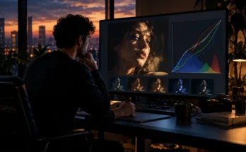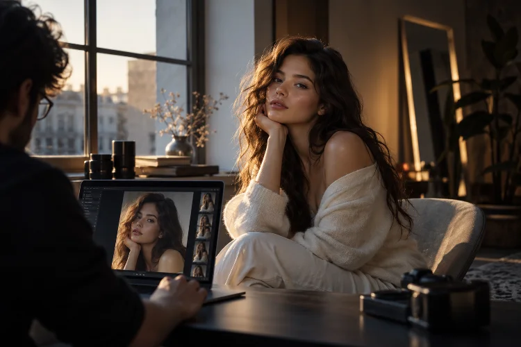
A cinematic color grade can completely transform a photograph. Cool shadows can add atmosphere, warmer highlights can create intimacy, and carefully muted colors can make an ordinary portrait feel like a frame pulled from a film.
The problem starts when the effect reaches the subject’s skin.
Push teal too aggressively and healthy skin may turn gray. Add too much warmth and faces become orange. Reduce saturation globally and people can suddenly look tired or lifeless.
That is why building cinematic color grades without destroying natural skin tones requires more than applying a preset or moving a few color wheels.
Good grading separates creative atmosphere from color correction, then controls different parts of the image independently.
Modern editors such as Lightroom and Capture One make this much easier through targeted color adjustments, curves, masks, and dedicated skin tools.
The goal is not perfectly neutral skin under every condition. It is believable skin that still belongs naturally inside your chosen cinematic palette.
Correct White Balance Before Creating the Look
A strong grade needs a dependable starting point.
If skin is already too green, orange, or blue before creative grading begins, adding stylized color usually makes the problem worse. Correct obvious white-balance problems first.
Lightroom provides Temperature and Tint controls specifically for adjusting overall color balance, alongside more targeted color tools. Adobe describes these controls as a way to correct color casts before moving toward more selective adjustments.
This does not mean every portrait needs perfectly neutral white balance.
A photograph shot during golden hour should still feel warm. A nighttime scene illuminated by cool window light can remain cool.
The important difference is intention.
Correct enough that the skin looks believable within the lighting environment. Then begin building the cinematic mood.
For example, if an indoor portrait is excessively yellow because of mixed artificial lighting, reduce the cast before introducing warm highlights. Otherwise, your creative warmth is being stacked on top of an existing problem.
Build the Cinematic Palette Around the Skin
One of the safest grading strategies is to treat skin as an anchor.
Instead of creating an extreme color palette first and trying to rescue the face afterward, establish believable skin early and design the surrounding colors around it.
In many portraits, skin occupies combinations of red, orange, and yellow hues. Those ranges overlap with clothing, walls, wood, sunsets, and other objects, so global changes can easily create unwanted consequences.
Lightroom’s Color Mixer allows hue, saturation, and luminance adjustments to targeted colors, while Point Color can isolate narrower ranges for more precise corrections.
Imagine a portrait surrounded by green foliage.
Instead of warming the whole image to create a cinematic mood, you might mute the greens, push them slightly cooler, deepen their luminance, and leave the skin relatively untouched.
The surrounding palette changes dramatically while the person remains recognizable.
That type of seperation usually looks more sophisticated than applying one heavy color cast across everything.
Use Complementary Colors With Restraint
The teal-and-orange look became popular for a reason: warm human skin naturally contrasts with cooler cyan or blue environments.
But the principle matters more than the cliché.
You do not need bright orange faces sitting against electric teal backgrounds. A much subtler relationship usually feels more cinematic.
Try introducing a small amount of cooler color into shadows while allowing skin and brighter areas to remain warmer.
Lightroom’s Color Grading panel allows separate hue and saturation adjustments for shadows, midtones, and highlights, with additional blending control between tonal regions.
Suppose a portrait is taken in a neutral gray studio.
You could introduce a slight blue-green bias into the shadows while keeping the midtones close to neutral and gently warming the highlights. The image gains color contrast without looking like a filter.
The best cinematic grades often contain less saturation than people expect.
Color contrast can remain visible even when the colors themselves are restrained.
Protect Midtones Where Skin Usually Lives
Many aggressive grades fail because the photographer thinks only in terms of highlights and shadows.
Skin often occupies a significant part of the midtone range.
If you heavily tint the midtones, the face may receive much more of the creative grade than intended.
This is why three-way tonal grading is useful.
You can push shadows farther toward a creative color, apply a smaller complementary adjustment to highlights, and keep the central tonal range comparatively restrained.
The exact distribution depends on the photograph. Darker skin, bright directional lighting, backlighting, and underexposed portraits can place important skin information across different tonal ranges.
Do not assume every face exists neatly in the same exposure zone.
Use the histogram and your eyes together.
A cinematic effect should support the portrait, not become more visually important than the person.
Separate the Subject With Masks
Sometimes global color tools simply cannot produce the result you want.
That is where masking becomes essential.
Current Lightroom masking tools can identify people and allow targeted adjustments to areas including facial skin, body skin, lips, hair, clothing, and other features. This means photographers can grade the environment strongly while protecting or correcting skin independently.
Imagine a portrait where you want the room to feel cold and slightly green.
Applying that treatment globally may make the subject look unhealthy.
Instead, create a background mask and push the environment toward the desired palette. Then use a separate people or facial-skin mask to preserve more neutral warmth.
The result feels integrated because both regions still share the same exposure and lighting, but you gain much finer color control.
Capture One offers a similar layer-based workflow. Its Color Editor can be combined with local adjustments, allowing different people or regions to receive independent color corrections when necessary.
Masking is not cheating.
It is simply modern darkroom control.
Use Dedicated Skin-Tone Tools for Uneven Color
Even correctly exposed skin is rarely one perfectly uniform color.
Cheeks may be redder. Foreheads can be warmer. Shadows around the jaw may shift cooler, while makeup, reflected light, and environmental colors can create additional variations.
Trying to eliminate every difference can make skin look artificial.
The goal is controlled variation.
Capture One’s Skin Tone mode is designed specifically for this kind of work. It allows photographers to select a reference skin color and adjust hue, saturation, and lightness while using uniformity controls to bring surrounding variations closer to that reference.
This becomes especially useful after strong contrast or saturation changes, which can exaggerate patchiness in skin.
However, avoid pushing uniformity too far.
Real skin naturally contains color variation. Removing all of it can produce the plastic appearance often associated with excessive retouching.
Think refinement, not replacement.
A subtile reduction in redness around the cheeks may be enough.
Build Contrast Before Adding Extreme Color
Sometimes what makes an image feel cinematic is not color at all.
It is tonal structure.
Deep but detailed shadows, controlled highlights, strong subject-background separation, and carefully shaped contrast can create far more cinematic impact than aggressive color shifts.
Before adding dramatic blues or greens, work on the luminance structure.
Use curves to decide how deep the blacks should feel, how gently highlights roll off, and how much separation exists through the midtones.
Adobe’s Lightroom tools provide curve controls for shaping tonal range as well as individual RGB channels, allowing tone and color relationships to be adjusted separately.
A gentle S-curve might increase contrast. Slightly lifting the black point can soften deep shadows for a film-inspired result.
Once the tonal foundation works, much smaller color adjustments are often required.
This is one of the easiest ways to avoid oversaturated “cinematic” edits.
Make the lighting feel cinematic first. Then let color support it.
Watch Orange, Red, and Magenta Carefully
When skin begins looking wrong, check these ranges before rebuilding the entire grade.
Too much orange saturation creates the classic fake-tan effect. Excessive red can exaggerate cheeks, noses, ears, or blemishes. Too much magenta may make skin feel synthetic.
Instead of reducing saturation globally, target the problematic range.
Point Color and other targeted tools allow narrow color selections to be adjusted without affecting unrelated areas of the photograph.
Luminance matters too.
Sometimes skin does not need less orange; it needs slightly brighter orange luminance. Changing brightness can alter how saturated a color appears without dramatically changing its hue.
This is why blindly copying HSL values between photographs often fails.
Different cameras, lighting conditions, subjects, makeup, and surrounding colors produce different starting points.
Your overall aesthetic can remain consistant while the exact correction changes from image to image.
Compare Skin Across the Entire Series
A beautiful single photograph is not necessarily a successful grade.
If you are editing an editorial story, campaign, portrait series, or wedding set, skin should remain reasonably coherent as lighting changes.
Place several finished photographs beside one another.
Does the same person suddenly look orange indoors and pale outdoors? Do shadows become green only in certain frames? Does one photograph have dramatically stronger saturation?
Reference images are extremely useful here.
Choose one or two frames where the skin and overall palette feel right. Use them as visual anchors while adjusting the rest of the collection.
Capture One’s targeted skin controls and Lightroom’s masking and color tools can help correct individual frames without abandoning the broader grade.
Remember that consistency does not mean identical color.
Different lighting should still look different.
You are maintaining a believable visual relationship, not forcing every face to the same RGB value.
Know When the Grade Has Gone Too Far
A cinematic grade should create atmosphere without constantly announcing itself.
One useful test is to temporarily reduce the effect.
If the photograph suddenly looks dramatically more believable at half the grading intensity, the original version may have been pushed too far.
Also zoom out.
When editing skin at high magnification for too long, photographers can become obsessed with tiny variations that viewers will never notice.
Then check the full frame again.
Does the face belong naturally within the enviroment? Is the subject still visually dominant? Do shadows feel intentionally colored rather than contaminated?
You can also step away briefly and return with fresh eyes.
After staring at teal shadows or warm highlights for a long time, your visual perception adapts. Excessive color starts appearing normal.
A convincing cinematic style usually comes from many restrained choices working together rather than one dramatic slider.
Building cinematic color grades without destroying natural skin tones is ultimately an exercise in separation and restraint.
Start with believable white balance, establish healthy skin, and then build the creative palette around it using HSL adjustments, tonal grading, curves, and targeted masks.
Keep midtones under control, watch orange and red carefully, and use dedicated skin tools only as far as necessary. Most importantly, remember that cinematic photography does not require extreme colors.
Try building your next grade from contrast first and color second. Protect the skin, push the surrounding environment more freely, and compare several images together before finalizing the look.
When viewers notice the mood before they notice the editing, the grade is doing its job.